
A General Overview of Reports and the Dashboard
There are currently eight types of reports (including the web dashboard) available to view within Time Doctor.
NOTE: If you think of any additional reports you would like to see, do not hesitate to contact us at support@timedoctor.com We track feature requests very closely so that our users can get the most out of Time Doctor.
You can access these reports from any page by hovering your mouse over Reports in the panel on the left-hand of the screen.
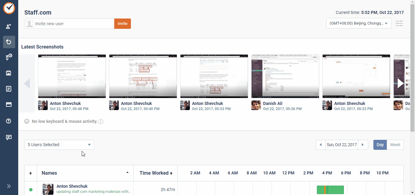
1. Dashboard
This is the first page you will see when you log into your Time Doctor account online. For managers, this page shows a handy at-a-glance view of each user's current status (on the left), their total time worked for the day (or week), and the times that they worked. The same is displayed for non-managers, but only that particular user's information will be shown. Moving your mouse cursor over the timeline will allow you to see which tasks were being worked on and for how long. You can also change the date range in the upper right-hand corner.

2. Timesheet
The Timesheet Report is a simple way to display the total amount of payable time worked on a given day for all users across a date range or on a single day. Click here for more information on the Timesheet Report.
3. Time Use
The Time Use Report shows a breakdown of the total time worked by each user as well as the amount of time spent on each of their tasks along with the associated projects. Click here for more information on the Time Use Report.
4. Timeline
The Timeline Report shows a detailed, by-the-minute breakdown of a single day's activity for one or more users. The Timeline Report is view only with the option to export or print. Click here for more information on the Timeline Report.
5. Poor Time Use
The Poor Time Use Report shows when a user visits a website which may not be work-related. The reason why these websites are labeled potential poor time use is that some, such as Facebook or YouTube, are sometimes used for work. It is up to you to decide if visiting these sites is truly work-related. Only websites that are used for 10 minutes or more are included in this report. Click here for more information on the Poor Time Use Report.
6. Web & App Usage
If enabled, the Web & App Usage Report shows you which websites and applications you and your employees have used while working. This report allows you to view, print, and export that information. Managers will receive a weekly report which includes the time spent on emails and chat as well as a breakdown of the websites and applications that were used. Individual users will receive the same report outlining their own time usage statistics. Click here for more information on the Web & App Usage Report.
7. Projects
The Projects Report shows you how much time is being spent on which projects and by whom. It can also show the dates that each user worked on each project in detail. Click here for more information on the Projects Report.
8. Attendance
The Absent & Late Report shows you who was absent or late for their scheduled work hours and the reason why. The report, once generated, can be exported as a .CSV or .XLS file. Users can add their reasons for being absent or late by selecting Absent and Late Status from the Payroll menu. Click here for more information on the Absent & Late Report.